Greenway accessibility project hero
54% of residents in Mecklenburg County live in neighborhoods whose center is more than 1 mile from a greenway entrance

Accessible Greenways: Theory vs. Reality

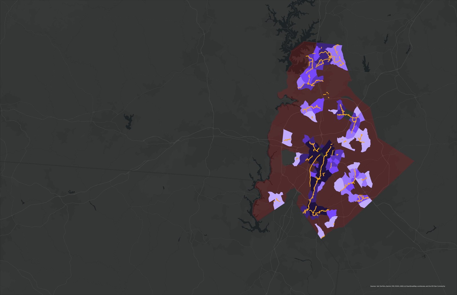
A multi-method analysis was conducted to assess greenway accessibility and its relationship to population health outcomes in Charlotte. Accessibility was quantified using a floating catchment area (FCA) model, generating a supply-to-demand ratio based on greenway area and population within a one-mile threshold. The analysis revealed a highly skewed distribution, with most tracts exhibiting no measurable access and higher values concentrated near core corridors. The results and limitations of the study sparked a hypothesis that proximity to green space may be dependent on sidewalk connectivity and other built environment features in order to impact health.

Greenway accessibility map

Accessible Greenways: Theory vs. Reality

A multi-method analysis was conducted to assess greenway accessibility and its relationship to population health outcomes in Charlotte. Accessibility was quantified using a floating catchment area (FCA) model, generating a supply-to-demand ratio based on greenway area and population within a one-mile threshold. The analysis revealed a highly skewed distribution, with most tracts exhibiting no measurable access and higher values concentrated near core corridors. The results and limitations of the study sparked a hypothesis that proximity to green space may be dependent on sidewalk connectivity and other built environment features in order to impact health.

54% of residents in Mecklenburg County live in neighborhoods whose center is more than 1 mile from a greenway entrance

Reflections on Methodology

The study’s limitations became the question.

Each diagram below traces a gap in the original model, and the reasoning that drove a more rigorous second analysis.

Geodesic centroid limitation diagram
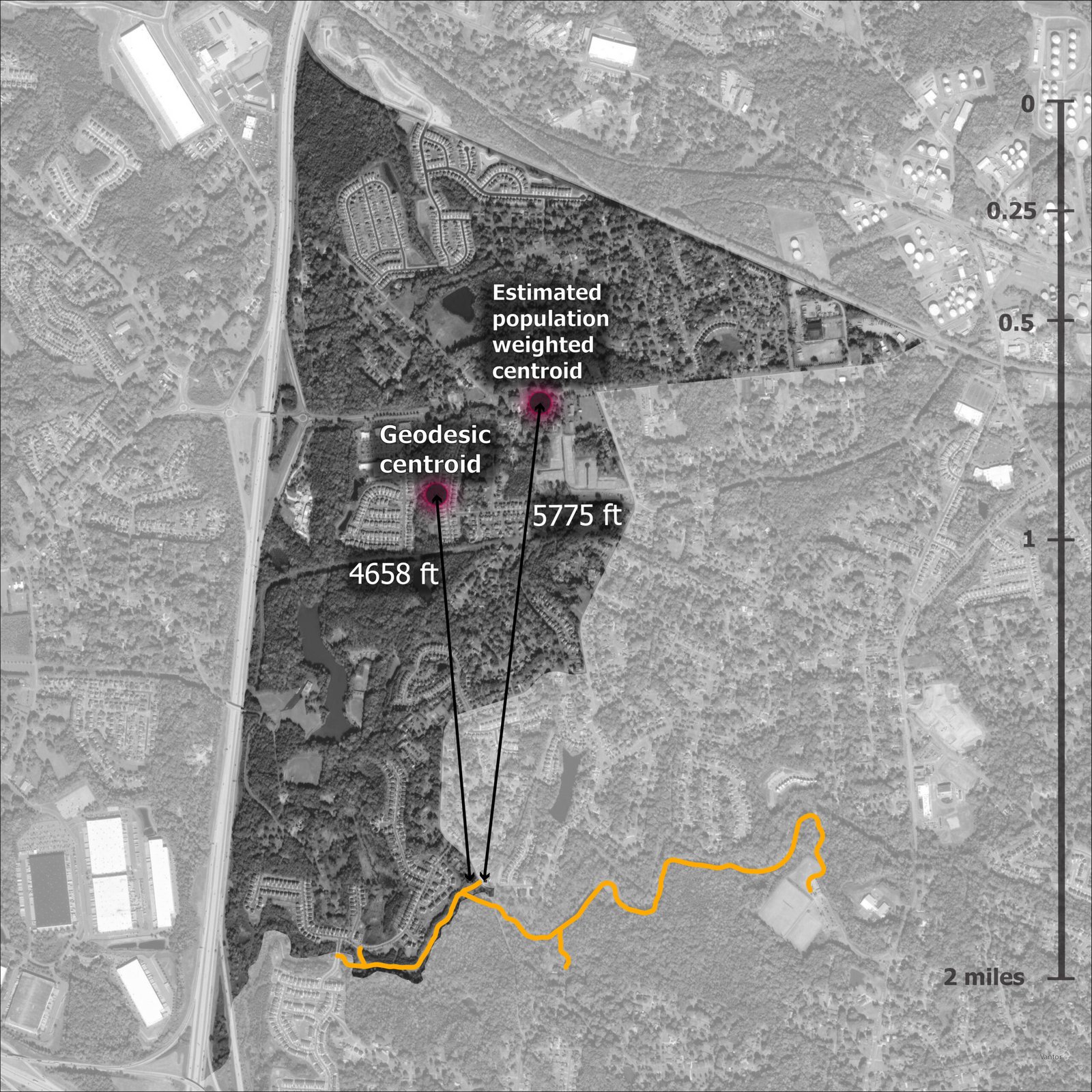
Centroid Limitation A major limitation with this study is the use of geodesic centroids to measure proximity of a neighborhood to a greenway. Reality shows that a population weighted centroid will often be farther or closer to the service. In this case, a tract that falls inside the catchment area likely would not have if population weighted centroids been used.
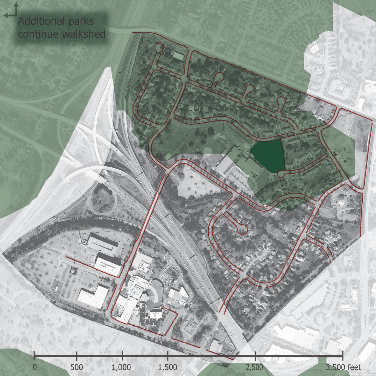
Euclidean buffer vs walkshed diagram
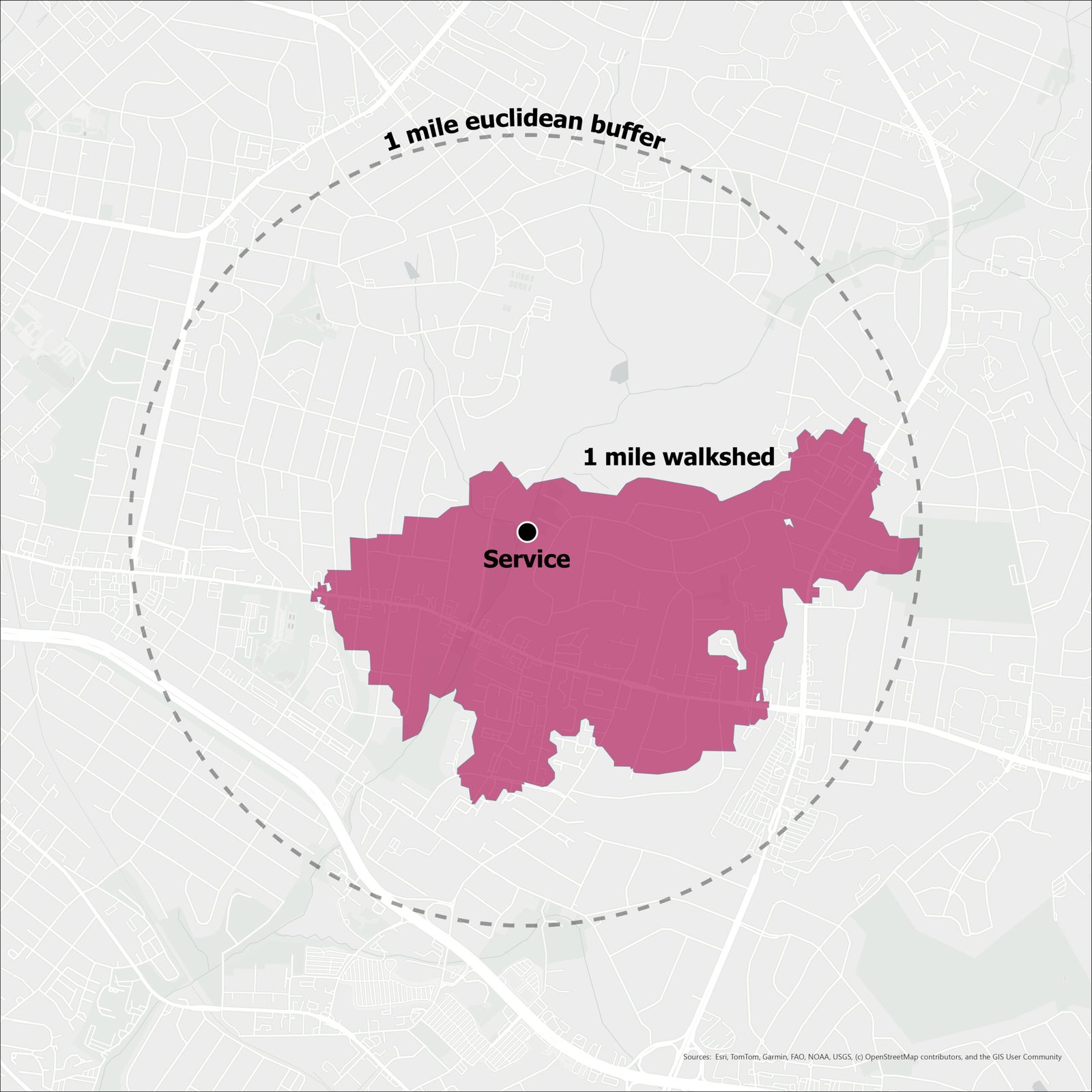
Euclidean Buffer vs. Walkshed While Euclidean buffers serve as a good starting point, the weaknesses compared to using walksheds is apparent. Measuring distance to a service “as the crow flies” likely overstated the greenway accessibility of many neighborhoods. Note: this diagram is somewhat exaggerated to illustrate the constraint of Euclidean buffers.
Census tract highway division diagram
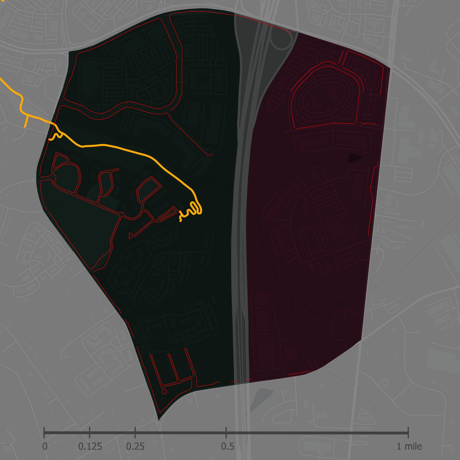
In this case, the entire census tract is given the same greenway accessibility ratio even though it is divided by a major highway with few crossing points. If walksheds and sidewalk coverage were considered, it would likely represent the dynamic between greenways and residents better.
Infrastructure as Intervention hero

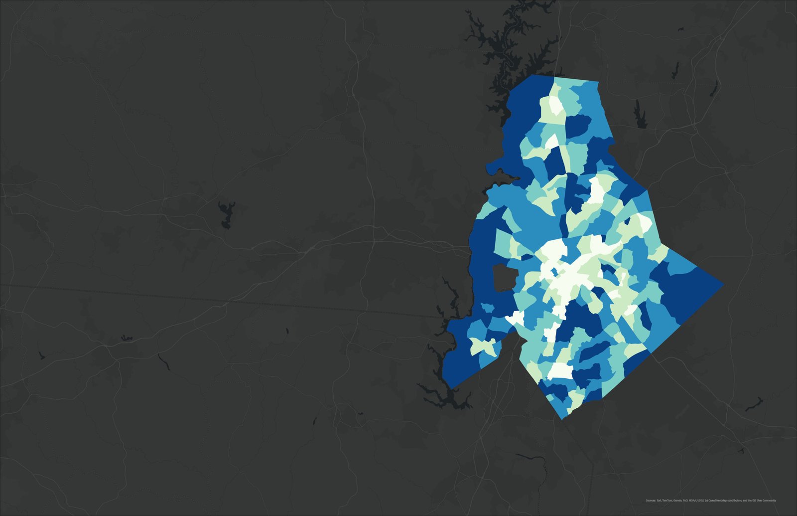
Figure · Walkshed Coverage

Park & Greenway Access by Census Tract

Share of each tract’s land area within a half-mile walk of a park or greenway entrance.

brighter = more covered

Part 2: Infrastructure as Intervention

The findings of the initial greenway accessibility research prompted a hypothesis: Greater park access is associated with lower obesity prevalence after accounting for neighborhood demographic and accessibility factors, particularly sidewalks. Thus, a secondary statistical analysis examines associations between accessibility and obesity prevalence, exploring the idea that limited proximity to parks and greenways may be linked to adverse health outcomes. These findings underscore the importance of integrating spatial accessibility metrics into public health and planning frameworks.

Project team: Mann Patel, Jackson Plemmons, Sydney Stine, Erik Darden

Infrastructure as Intervention map

Part 2: Infrastructure as Intervention

Figure · Walkshed Coverage

Park & Greenway Access by Census Tract

Share of each tract’s land area within a half-mile walk of a park or greenway entrance.

brighter = more covered

The findings of the initial greenway accessibility research prompted a hypothesis: Greater park access is associated with lower obesity prevalence after accounting for neighborhood demographic and accessibility factors, particularly sidewalks. Thus, a secondary statistical analysis examines associations between accessibility and obesity prevalence, exploring the idea that limited proximity to parks and greenways may be linked to adverse health outcomes. These findings underscore the importance of integrating spatial accessibility metrics into public health and planning frameworks.

Project team: Mann Patel, Jackson Plemmons, Sydney Stine, Erik Darden

Negative binomial regression residuals map
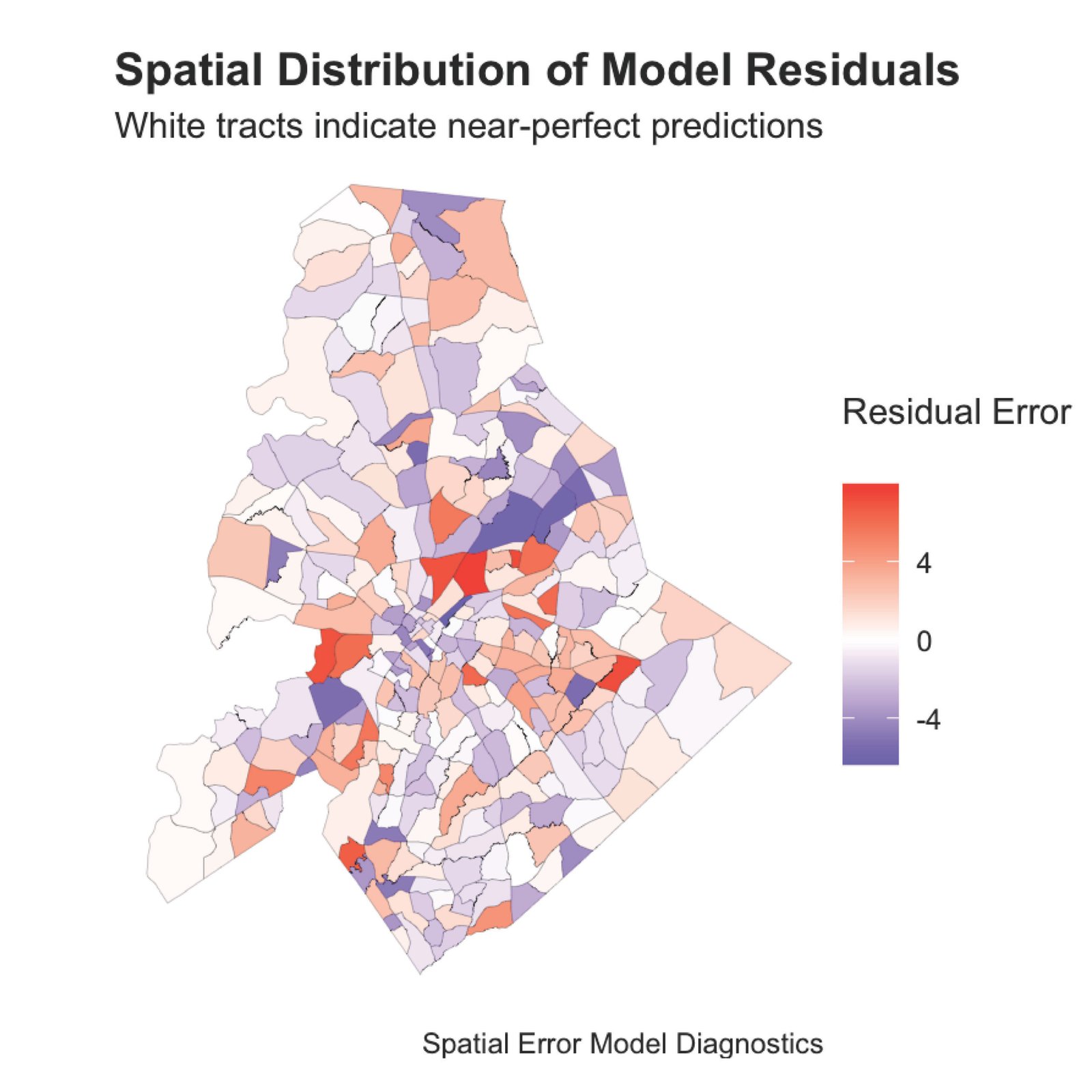
Spatial Distribution of Negative Binomial Regression Model Residuals White tracts indicate near-perfect predictions. The lack of autocorrelation indicates the model is not systemically skewing predictions. In lieu of sub-tract level population data, this model uses percent coverage per tract by parks and greenways to calculate supply, helping resolve inaccuracies from geodesic centroids.
Walkshed analysis map
Analysis Upgrade: Walksheds Swapping Euclidean point-to-point measurements strengthens the validity of the findings. There is still room for improvement, since park/greenway quality, sidewalk quality, crime rate, noise pollution, and nonlinear thresholds were not accounted for.
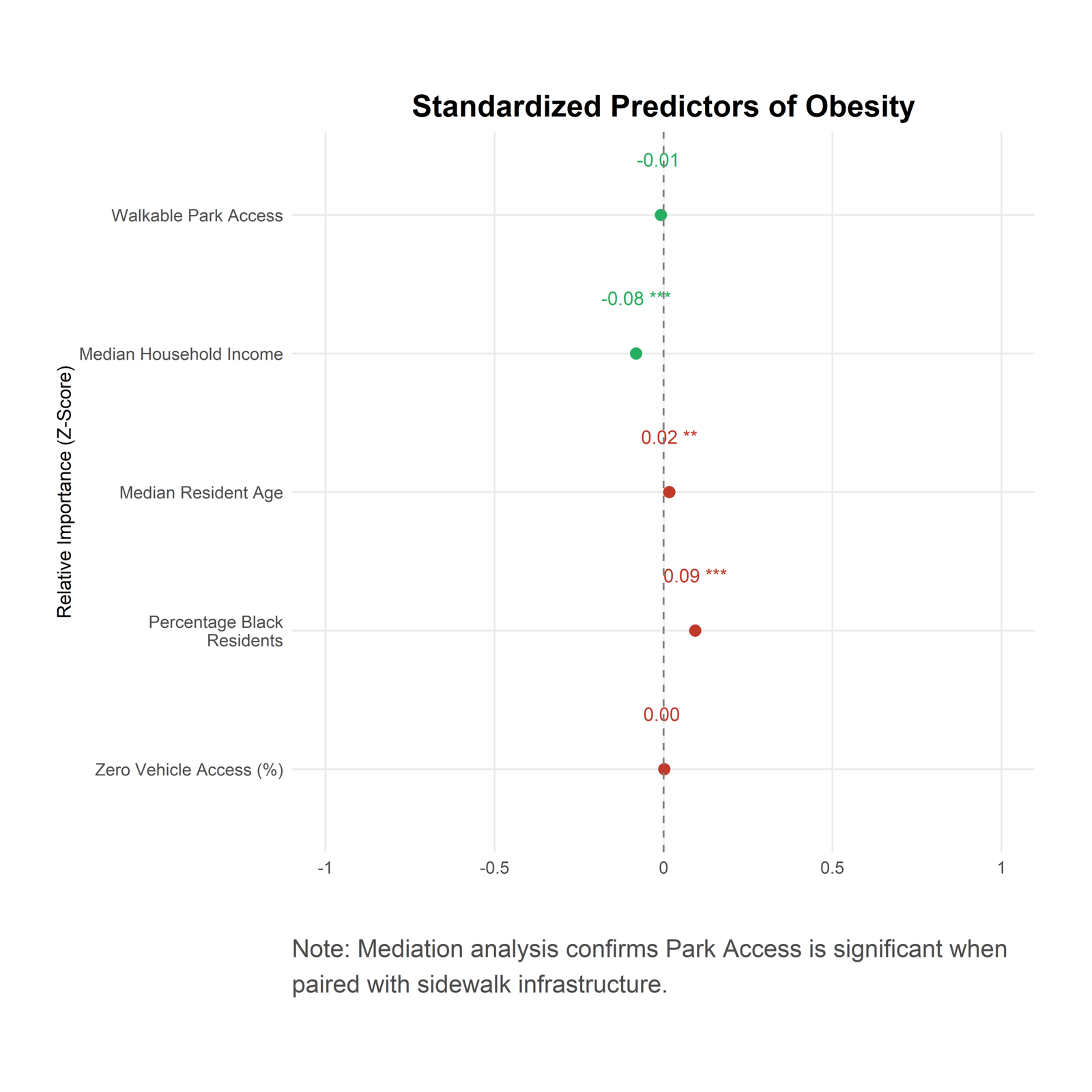
Mecklenburg final analysis chart
Our direct model identifies socioeconomic status (income and race) as the primary drivers of obesity. While “Zero Vehicle Access” and “Park Proximity” trend in the expected directions, their impact is statistically secondary to systemic economic factors.

Key Insight: Further mediation analysis revealed that park access becomes a significant protective factor only when modeled through the pathway of safe pedestrian (sidewalk) infrastructure.

Conclusions & Comparisons

Two methods, one verdict: walkable green space is the minority condition in Mecklenburg County.

Why obesity.
Greenway accessibility is only meaningful if it changes something on the ground. Obesity prevalence offered a measurable, spatially-resolved public health outcome, published at the tract level through the CDC’s PLACES dataset, that let the team test whether proximity to parks translates into a population-health signal, or whether it is overwhelmed by the socioeconomic forces that structure American cities. In other words, the obesity layer is the stress test for the accessibility work: it asks whether the geography of green space matters once you control for who lives where.

The two analyses converge. Part 1, using geodesic tract centroids and a one-mile threshold, found that 54% of residents live in neighborhoods whose center sits more than a mile from a greenway entrance. Part 2 abandoned the centroid shortcut entirely, measuring instead what share of each tract’s actual land area falls inside a half-mile walkshed of a park or greenway access point. Flipped to the positive, only 45% of tracts have the majority of their land within walking distance. Two genuinely different methods, and the county still splits almost in half.

That agreement is the point. One model measures residents without access at a loose one-mile threshold. The other measures tracts with access at a stricter half-mile threshold. Opposite framings, different units, different geometry, and both still land on roughly half the county on the wrong side of the line. When independent methods converge from opposite directions, the finding is no longer an artifact of how the lines were drawn. It is the pattern itself.

45% of Mecklenburg County’s 305 census tracts have the majority of their land area within a half-mile walk of a park or greenway entrance. The other 55% do not.
0% WALKSHED METHOD · ½-MILE THRESHOLD 100%

But convergence on scale came with a sharper finding on cause. The direct model identified socioeconomic status, namely income and race, as the dominant predictor of obesity, with park proximity and vehicle access trending in the expected directions but statistically secondary. The accessibility story did not disappear; it changed shape. Park access became a significant protective factor only when routed through the pathway of safe pedestrian infrastructure. Proximity alone is not enough. A greenway a half-mile away does little if there is no sidewalk to reach it.

That is the throughline from Part 1’s methodological doubts to Part 2’s mediation analysis: access is not a straight line on a map. It is conditional, infrastructural, and unevenly distributed, which is precisely why measuring it well, and pairing it with the right health outcome, matters for planning practice.